Methedology
This analysis was conducted using Boston's 2022 Police Incident Report data available on their
Open Data Portal, a daytime population estimation by
Oak Ridge National Lab, and landmarks provided by the
Boston Landmarks Commission.
The data required some cleaning as there were almost 120 different incident
types depending on the specific circumstances. For example there were 12 different types for a motor
vehicle accident. This process sorted these individual types into around 20 categories including an
other for the miscellaneous types that didn't fit into a category, like prostitution. From this, 8
categories and the Total were used in the final analysis due to the other categories not being relevant
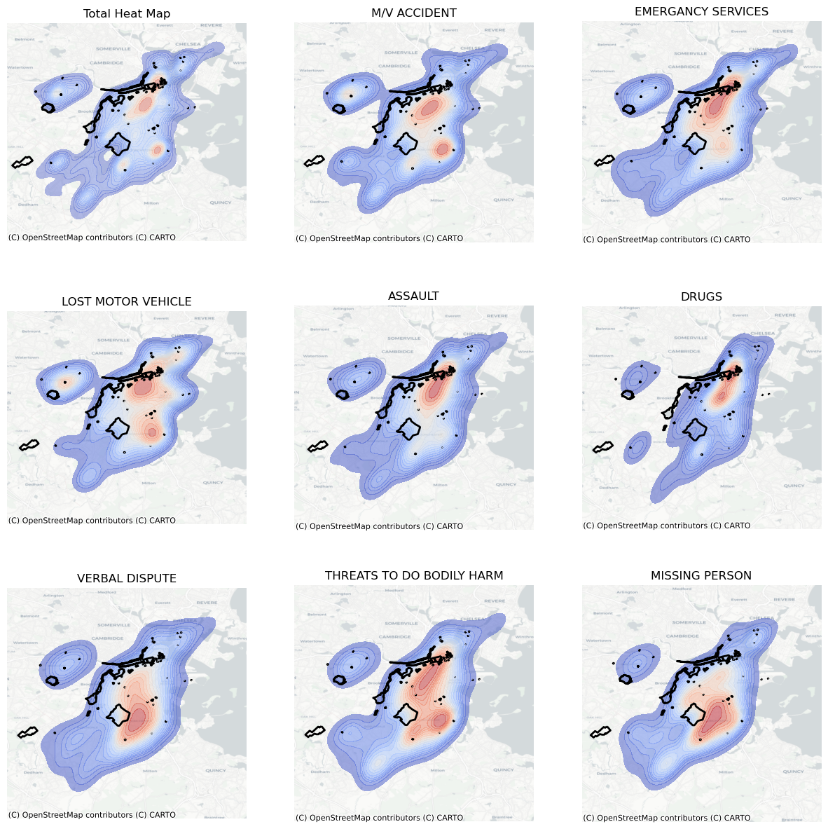
to a tourist. Using these categories 4 different maps and analysis were conducted. The first was a
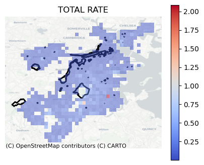
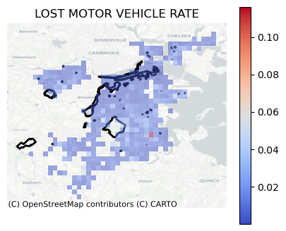
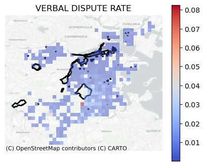
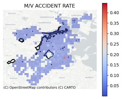
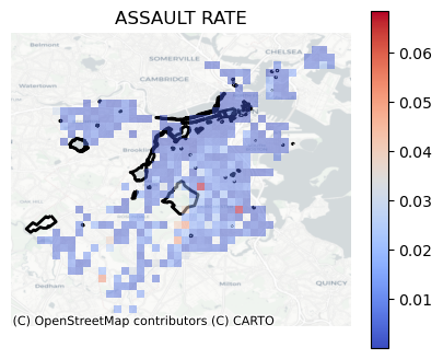
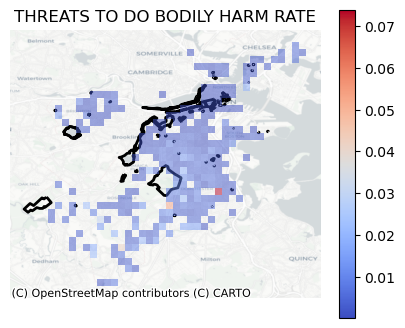
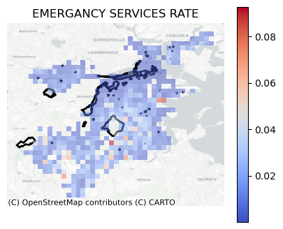
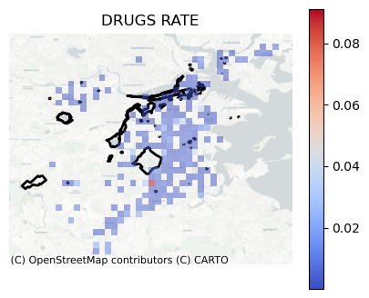
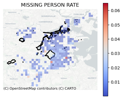
kernel density estimation, shown at the top. The second is the distribution of incidents rates adjusted
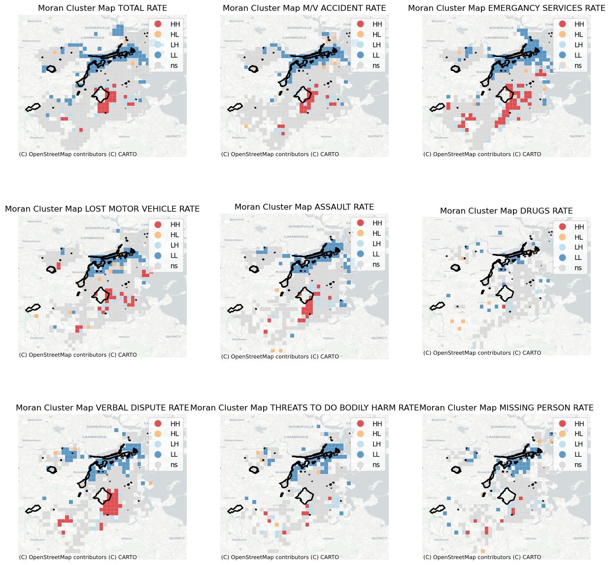
for the daytime population of the area, bottom left. The third analysis was a Moran's Cluster analysis,
of the rates, used to depict relative hot and cold spots throughout the city. And finally the last analysis
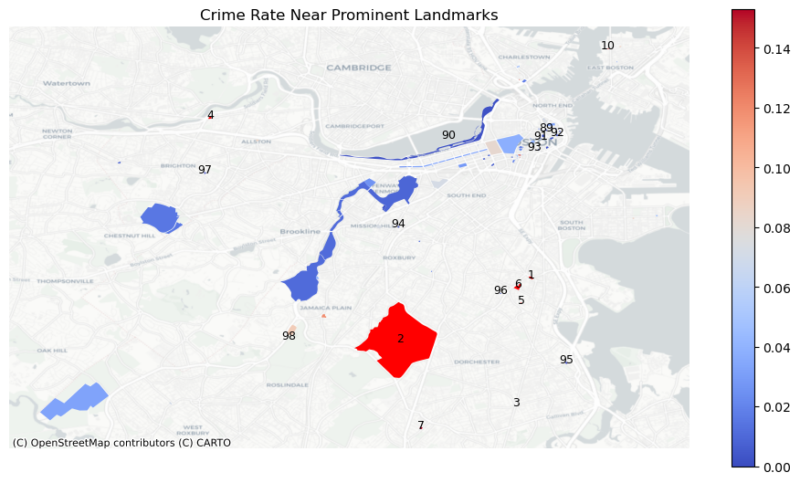
in the center shows the incident rate within 50 meters of each landmark.
Kernel Density Estimation

The Kernel Density Estimations, shown to above, depict where the individual incidents occur with Downtown and Dorchester being
the two areas with the majority of the incidents. Now these hot spots do not take into account the amount of people in the area
and only look at the raw counts. To address this and ensure that we are not just looking at the population distribution, the
daytime population was used to calculate the local crime rates to see where the incidents are disproportionately happening.
Interactive Rate Analysis
By normalizing the data by the Population we can see that the Northern area tends to have a lower
incident rate while the Southern and central areas contains more of the whites and reds indicating
a higher incident rate. In order to convert these low and high rates into hot and cold spots a Moran's
analysis must be conducted.
Moran's Analysis
Below is plots of the Moran's I analysis of the incident rates. This type of analysis is used to find locations
that have significantly higher, hot spots, and significantly lower, cold spots, values when compared to their
surroundings. These hot spots are depicted in red and orange with red being hot spots near other hot spots and
orange being hot spots near a cluster of cold spots. Conversely, cold spots are also depicted in two colors, blue
and light blue with the blue being cold spots near cold spots and light blue being the cold spots near a cluster of hot spots.

As we can see by looking at the various maps, there is always a cold spot that starts in downtown Boston and then follows
the river conversely Franklin Park has a hot spot surrounding it especially on its South and East sides. This would suggest
that one should stick to the Northern end of Boston.
Landmark Analysis

Landmarks Interactive
The above map shows the map of the Total Incident Rate around each of the location with the locations that had high
rates being labeled directly. Now two locations had such high rates that they were not directly included in the
legend as they both had rates of over 0.4. These two locations are Franklin Park and the James Blake House. It is
unsurprising that Franklin Park has such a high rate of incidents especially when looking at the Moran Cluster Maps
as it is surrounded by hot spots on its South and East. Furthermore if one was to look up Franklin Park online, you
would see multiple articles about crime and dangers in the area. There is some light at the end of the tunnel for
Franklin Park as City Officials have recently released a multi-million dollar plan to address the issues plaguing
the park and its surroundings
